It does seem rather grand to be discussing mathematics, however, the mathematics I am using are quite simple and they are easy to understand. The reason I was looking at mathematical formulas was that I had been doing a lot of work on world population and I had a simple graph which showed the world population over the past 100 years. The graph looked just like the type of graph which is commonly called a hockey stick graph. They show up a lot in stress testing and I wanted to compare stress analysis with population growth. It turned out that Newton had used these graphs so, I affectionately refer to them as Newtonian curves.
First, I need to show you a simple elipse divided into 4 quarters (Newtonian curves). Each quarter can be seen as a separate hockey stick graph. The D section, for example. might reflect population growth and the A section might reflect the cooling of a liquid against an ambient which was what Newton used it for

For my personal clarity of understanding, I did not want to confuse the issue of which quadrant to use in my work because I use all four quadrants in principle but I have only ever used the C quadrant when describing what I was doing. By doing this I have been able to look at changes to the shape of the graph without turning my brain upside down. Mind you, I am diagnosed with AS and I really do hope that you can benefit as I do from using the facilty. Take for example the following graph (which as always is a C quadrant) It shows some sort of growth (bearing in mind it is upside down) There is much that can be worked out from analysing the curve which represents the value over time. Points 3 and 4 represent the 2 major features of the graph. Prior to point 3, the changes in value over time are very small and mostly unnoticed. At point 3, they begin to get noticed and at point 4 the changes in value are more frequent and greater and outside control. If we see this graph as being, for example, the growth of greenhouse gasses in the atmosphere, we can come up with some quite realistic information.

Point 3 is really too distinct though. There will allways be a point 3 which represents the last point where the situation can be resolved but for reasons of human complexity, different humans will recognise different points as being point 3. That is irrespective of it actaully being a fixed point by the way. If we look at commentaries now, there are diverse reasons given for climate change from very learned people who cannot actually agree for various reasons. The absolutely crucial thing about point 3 is that is is the last chance saloon in terms of remedial action and a guess about where it is seems so inappropriate. Clearly, we cannot have it as a single point in time because no one would agree to the timing. Point 3 is better represented as an area arcing from a point prior to point 3 to an area arcing later than point 3. this gives us a much wider section to look at and understand. If we do the same with point 4, we end up with the same shape graph but with 5 sections to it. These can be labelled in a way the we can all understand and generally agree.
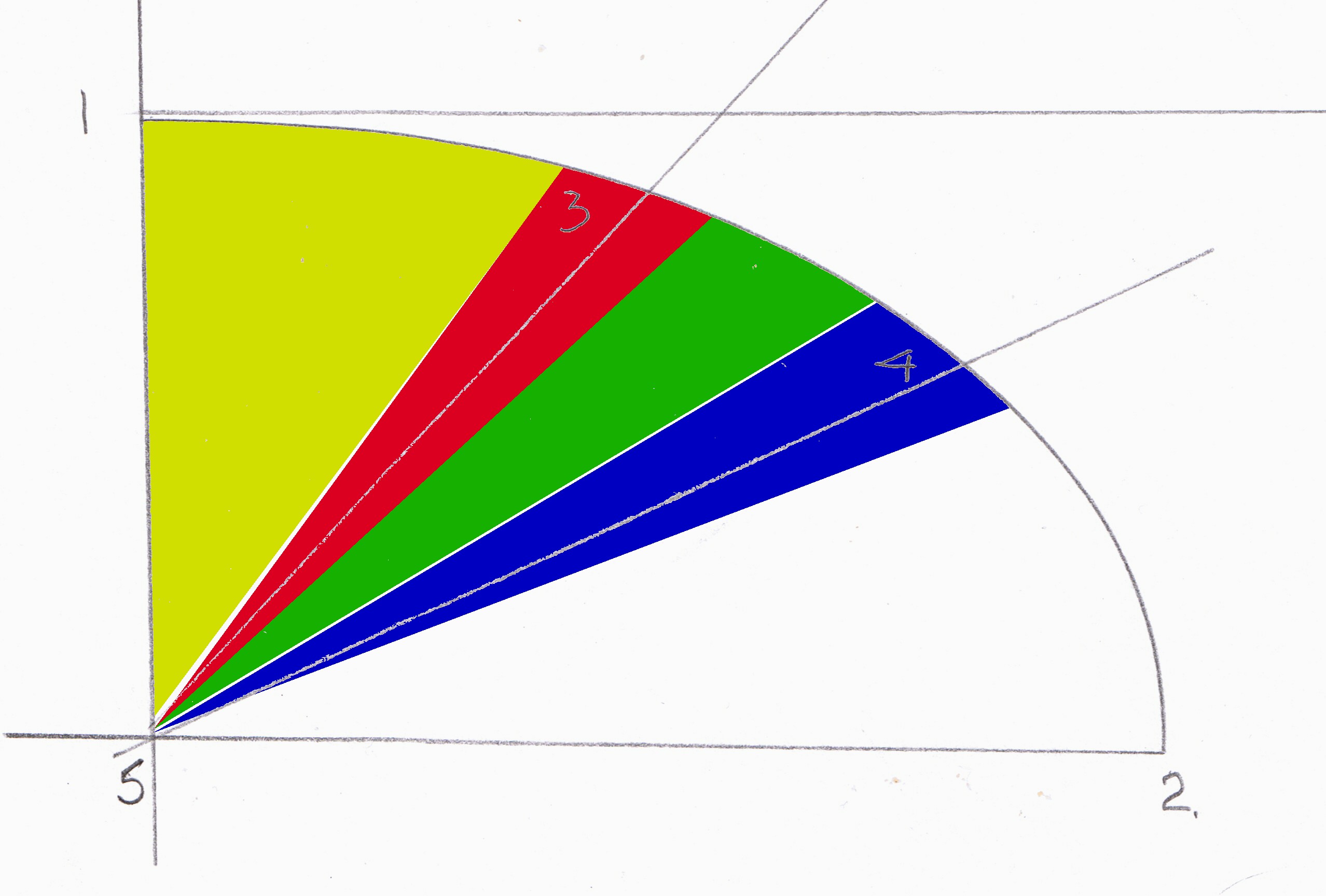
Yellow. period where change is small and unrecognised
Red. period where change has become noticeable to the extent that the causes have been investigated and even identified and remedial tactics are being attempted. As the period progresses, the amount of input required to alter the situation is increasing on an exponential scale and this period terminates at the point where the speed and greatness of the change is acknowledged to be too great to manage.
Green Freefall period where most energy will have to be extended towards fighting off the effects rather that dealing with the cause.
Blue. Period where the fighting of the effects becomes so intense, it is acepted that no solution can be found
White. Rapid slide into decline.
You may feel that you would like to argue the point that this type of graph is not relevant to the subject in hand (in this case global warming). In the graph's defense, I would say that if you can fit all the data up to now within the confines of a Newtonian curve, then there is every reason to accept that future data will also fit the same curve. I could have drawn this up in 1955 and forecast the global warming problem accurately up untill today. How could it be possible that I could not do it for twice that length of time. Strictly, it should be possible to counteract any decline in any form of situation but as you will see latter in my work, the amount of resources required at any none time are actually more than are available at that time. This is a basic rule in macro modelling when things go wrong. I am not asking you to accept my work, get a piece of paper, put some numbers down and dates and get accuarate numbers not guesses or estimates. Just join up the dots and see your own Newtonian curve. Fed up with global warming, try population. Need to try something different, try migration. Look at education, see what qualifications you will need to get a job in 2050!
We are currently in 2007 in the latter stages of the red section in terms of world polution and coincidentally in a simliar ,though slight retarded time in respect of world population. However as these 2 factors will loom large in my work, we would do well to remember how they fit in on the graphs.
What we can understand from these graphs and the underlying mathematics which produce them is that natural events proceed in two ways. They either become more frequent and more profound or less frequent and less profound. The decision is made simply by working out which direction they are going in. Finding which direction they are going in is really simple because we just have to look at the frequency and profundity to tell us.